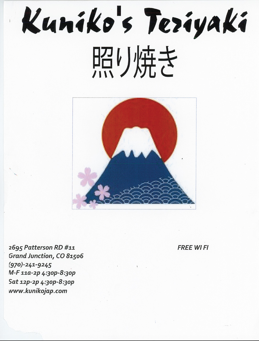
Kuniko’s Teriyaki Menu Redesign
This involves redesigning an existing restaurant menu to improve its clarity, organization, and visual appeal. The goal is to create a more concise layout that enhances readability while maintaining the restaurant’s brand identity. Emphasis should be placed on typography, spacing, and hierarchy to guide the customer’s eye and simplify decision making. The final design should balance aesthetics with functionality, resulting in a menu that is both attractive and easy to navigate.
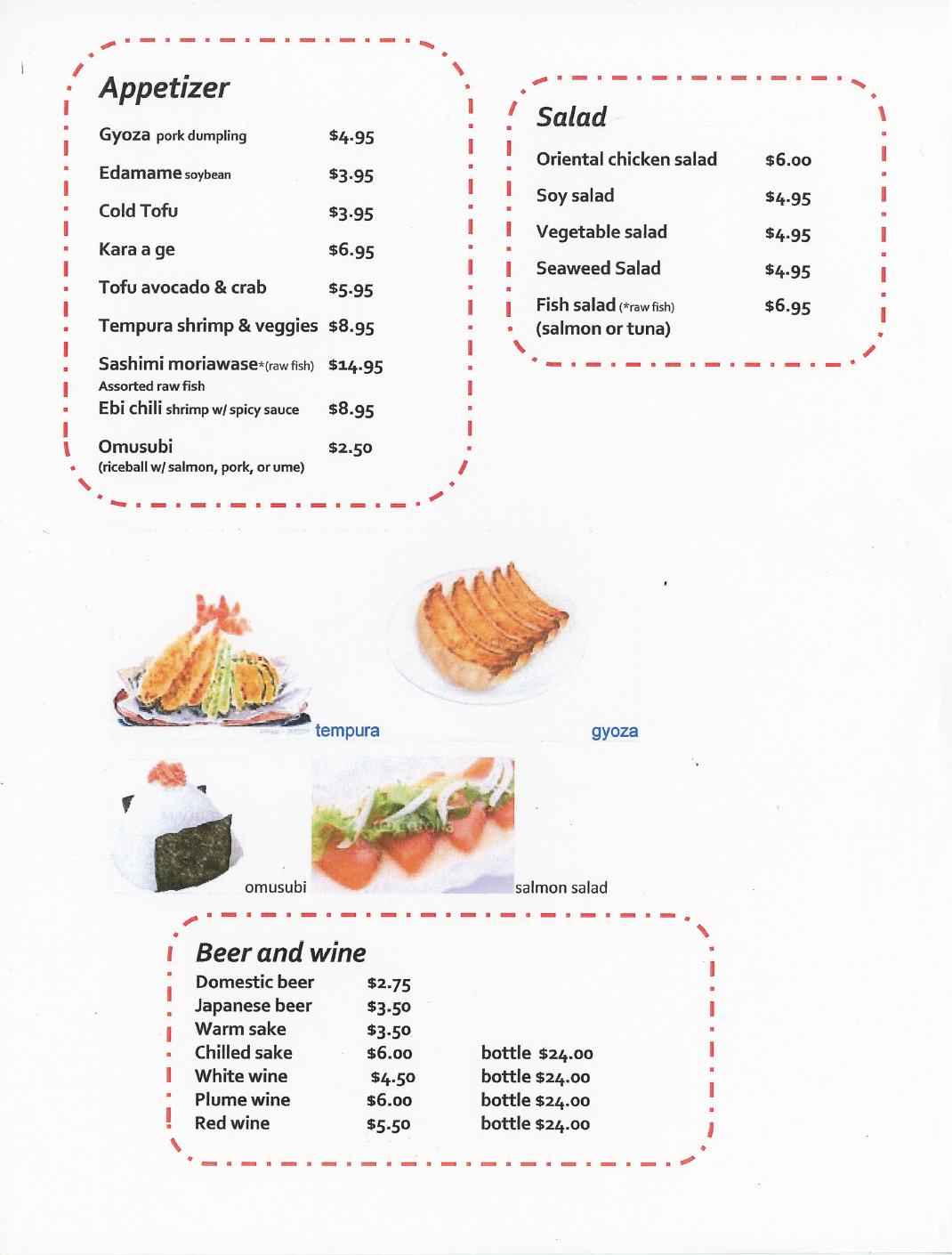
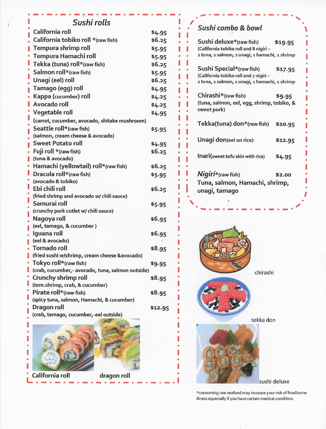
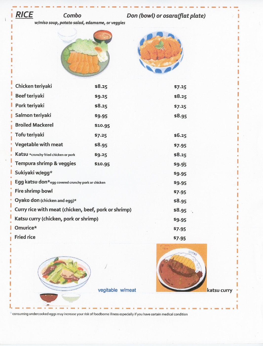
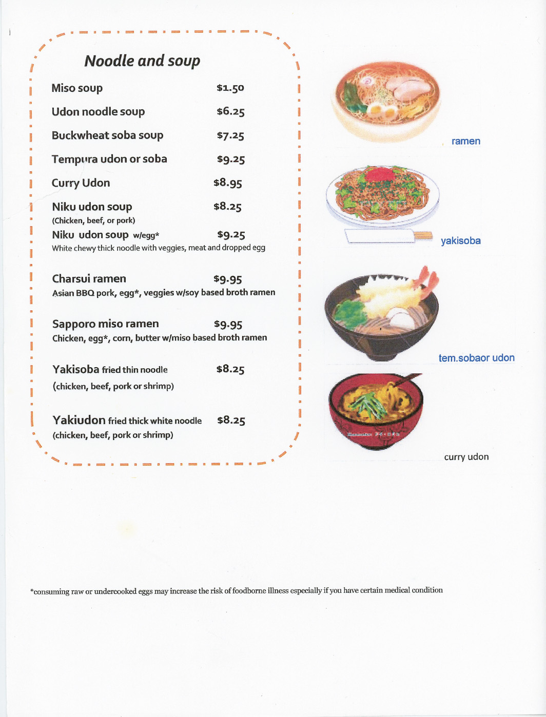
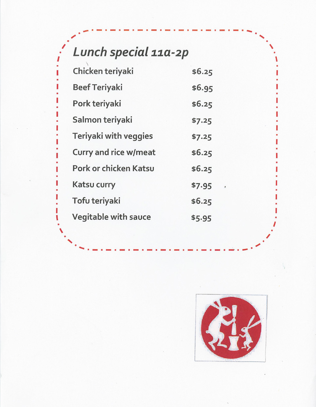
Original Menu Pages:
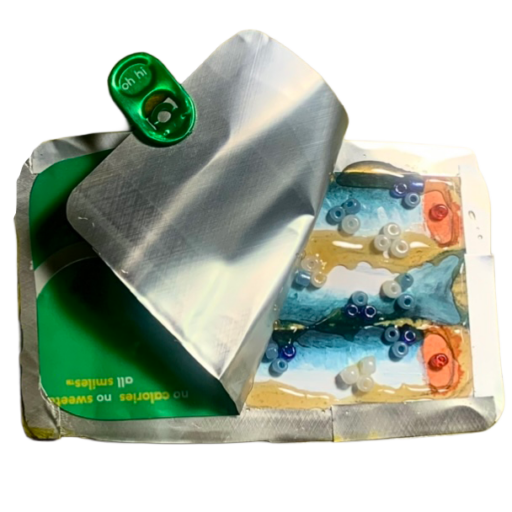
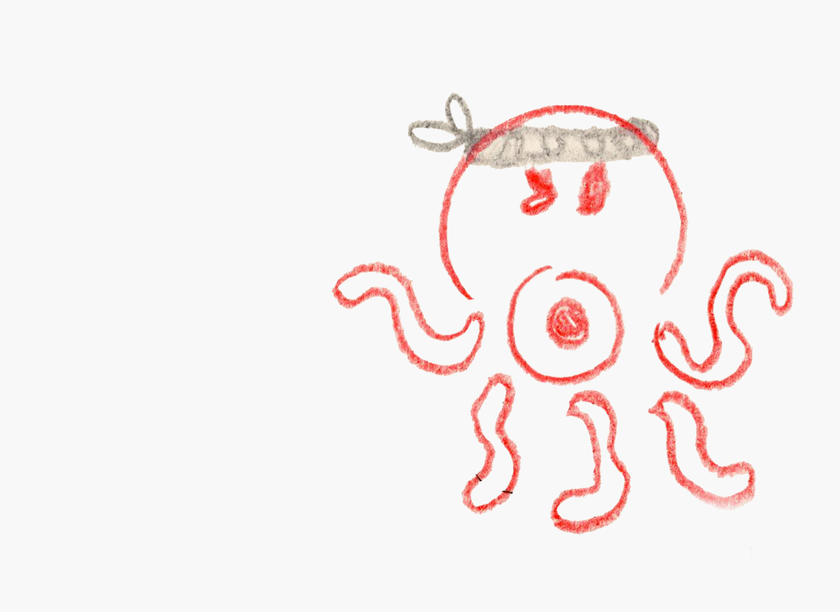
Drawing Process:
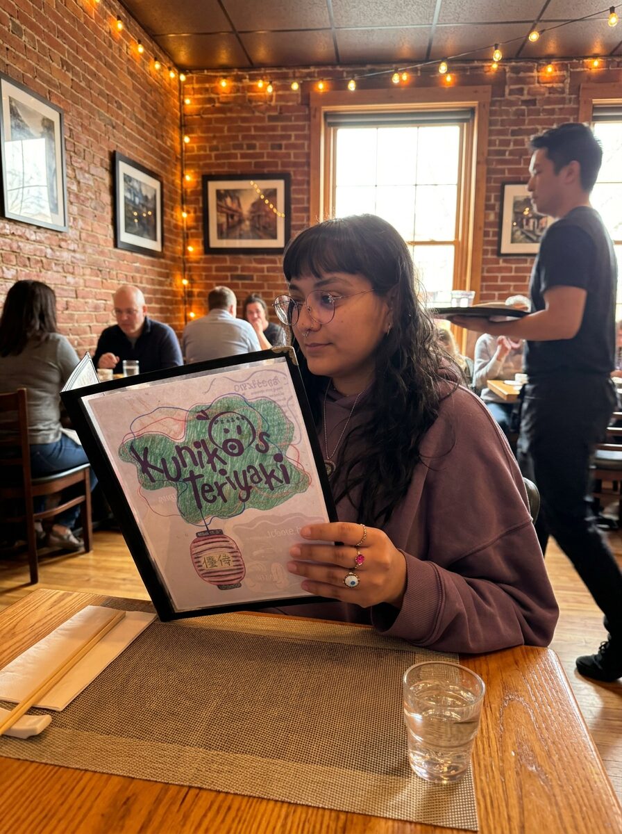
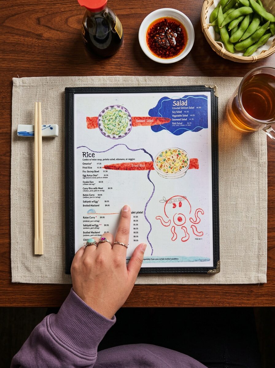
Revised pages in action:

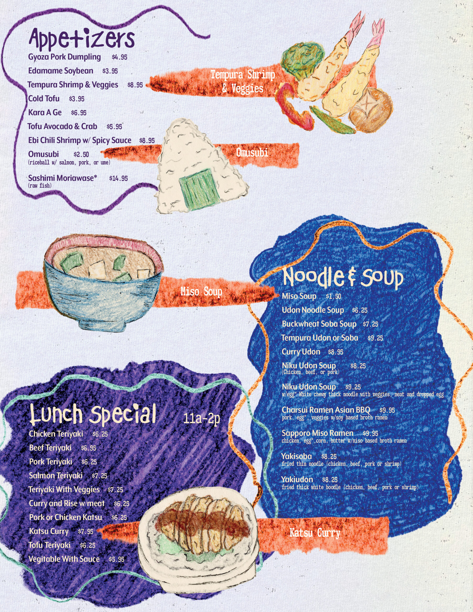
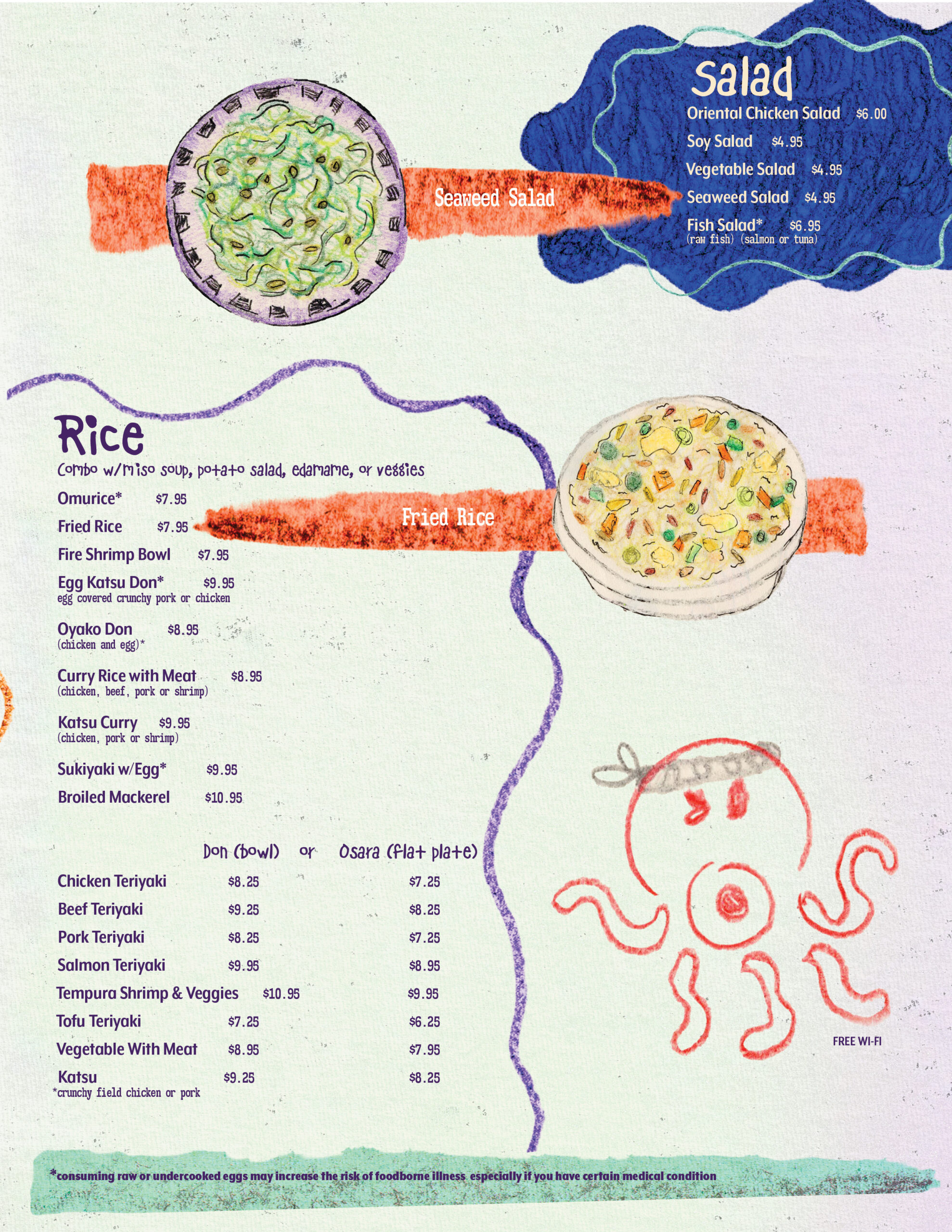
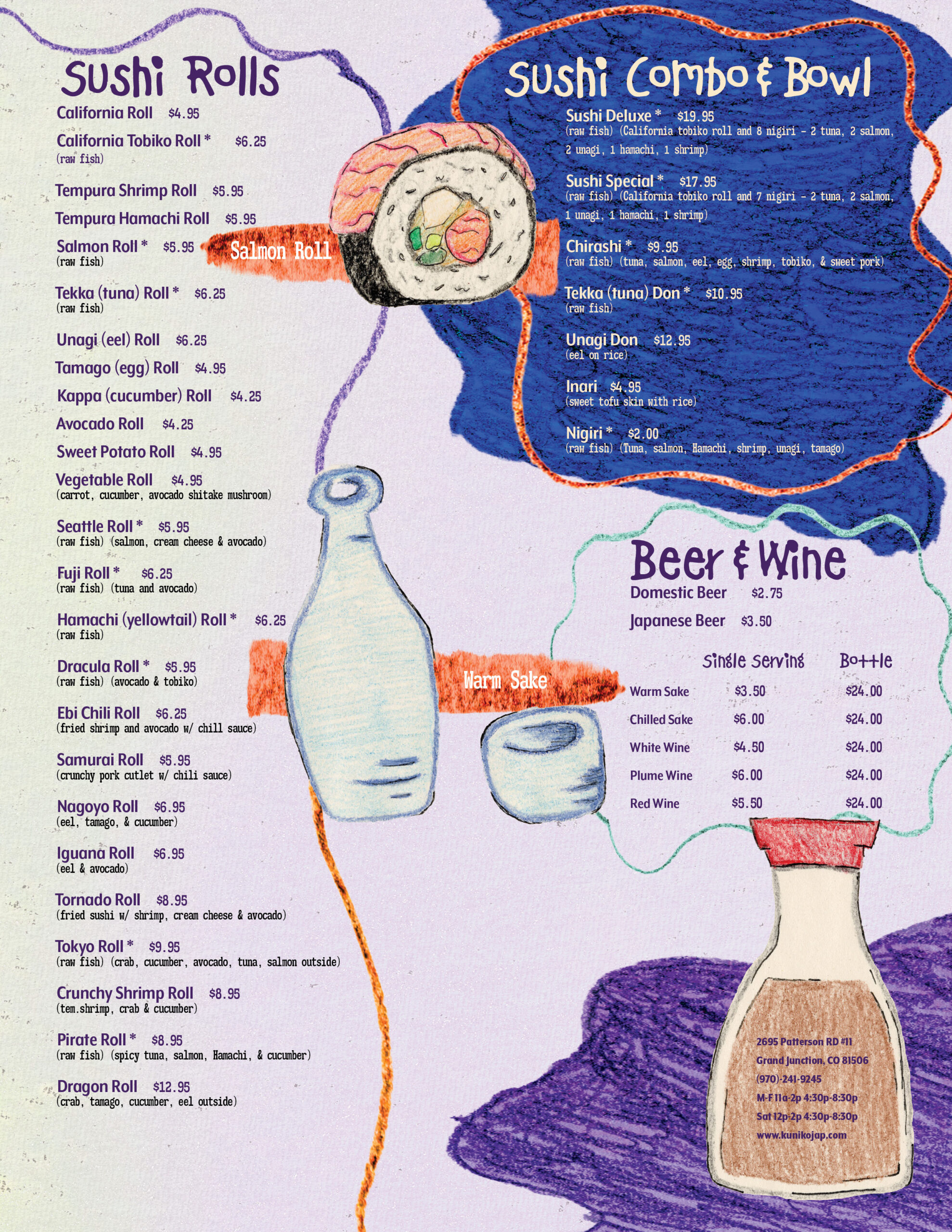
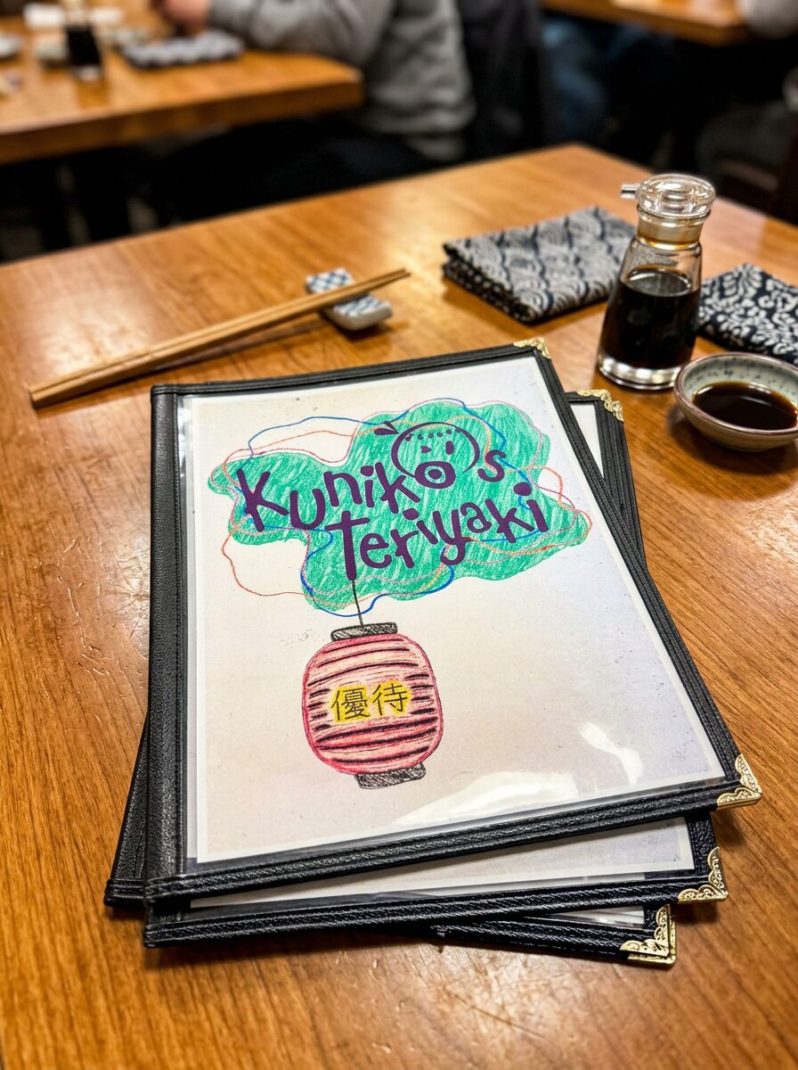
Kuniko’s is a family-owned establishment with humble beginnings. The restaurant is run by a mother & daughter duo. By brightening the color palette and implementing a crayon illustration style, they’re able to showcase their family-oriented values playfully.